Sunday, May 8, 2011
Monday, April 4, 2011
Audience Feedback
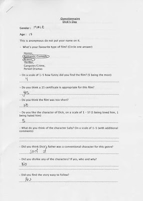
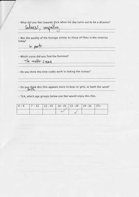
To get audience feedback of are film we gathered a group or about 20 aged 17 - 28 and created a questionnaire with various types of questions for them to fill out. The version of the film wasn't completely finished but it gave us input into what finishing touches we needed for the film.
Above is one of the questionnaires filled out.
Quotes from feedback:
- Music made everything feel depressing.
- Real day shouldn't have so much music.
- Backing track doesnt work in real day.
- Dream sequence needs a blur effect.
- Dream confusing, needs filter maybe a ripple effect.
- Birds tweeting when he wakes up, will heighten sense of reality.
- Music had a big effect on it.
- Music is like wallpaper over the film.
- Dialogue is too low.
- Music dominates.
- Lost humour by using music.
- Dry humour, cynical type of humour.
Magazine Article
Magazine Article Research
Final Cut Pro
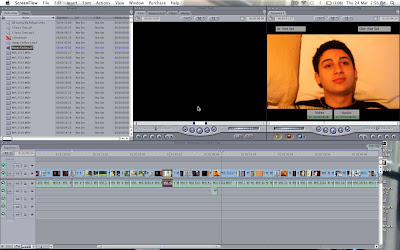 Final Cut Pro is used to edit footage used to created films, music videos, adverts...mainly anything that uses video. It is simple to use an easy to get hold of. It is uses the same methods that were used to edit films before computer were made, cutting the footage where you choose and moving it around.
Above is a snapshot of what it looks like.
Charley Lebetking took charge of the film editing with various input from the rest of the group.
SoundTrack Pro
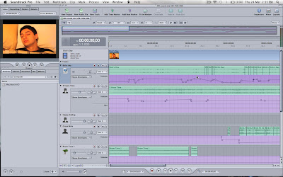 Soundtrack Pro is a sound editing software which we used to edit the sound in our film. It is quite a simple piece of software to use.
Above is a snapshot of what it looks like.
Charley Lebetkin and I took charge of the sound, as we both have experience in music, we have both composed lots of songs and are both performers.
Logic Pro
Logic Pro was used to create the songs we covered for our film, as we were not allowed to use copyrighted material covering the songs was a possible and simple option.
Above are the original versions of the two songs we covered.
Call sheet and Week shooting plan
Filming Schedule
Planning & Scheduling
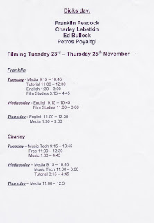
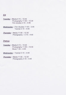 As media wasnt the only subject that we were taking our schedule had to be planned. We all had lessons at different times on different days. Filming was the main part of our media coursework and it was one of the parts that had to be done in our own time. When creating our schedule we had to find times that as a group we could film without missing too many of our other lessons.
Poster: Final Product
Poster: First and second draft
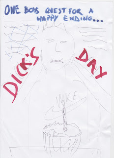
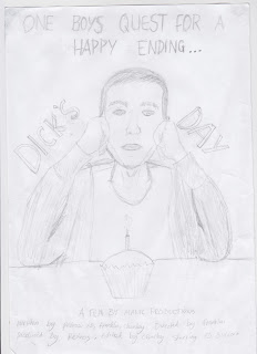 The poster was quite a short process, firstly we brainstormed ideas and talk about the look we wanted. After researching conventional poster of our chosen genre we found many similarities and elements that we wanted to include, such as the colour schemes, fonts and pictures used.
We then drew a rough sketch of the layout and style we wanted. After that we drew a more detailed version with some changes. The next step was taking it too photoshop and taking photos of the image.
Locations: Dicks house and bedroom
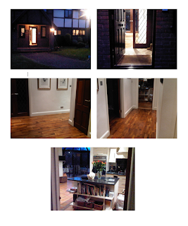
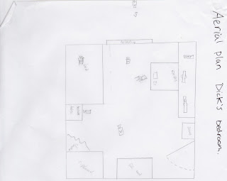
The location we chose to shoot our film, was planned and researched locations so that it represented Dick in the way we wanted to. Unfortunately due to problems with time and filming issues we had to use one location to film the house and bedroom. In the end it worked out well but we would have preffered to use the original locations chosen.
Character: Research
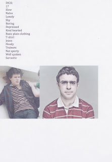 To create our character we had to research conventional characters used in our chosen genre.
These two characters are from different TV shows, on the left is from 'Skins' and the right is from 'The Inbetweeners'. By following the conventions for this type of character we have ensured that the audience will understand the type of film we are creating.
Character: Detailed information about the character of Dick
Saturday, January 15, 2011
Cameras
Poster Research
These are some of the posters that my group researched. We decided that the best way of creating are own poster was by looking at the conventions for each genre. As are film is a teen comedy, we looked at comedies in general, teen dramas and teen comedies. We have designed poster with the conventions used in mind e.g font, colour, style and the images used.
Subscribe to:
Comments (Atom)


